

Tuune's Recommendation Engine
2019-2022 | London, UK
Client
Tuune Health
Collaborators
-
4 UX/UI Designers
-
5 FE & BE Developers
-
5+ Medical Doctors
-
2 Regulatory Officers
Brief
“Empowering people with cycles to experience personalised healthcare using hormonal intelligence” is Tuune’s mission.
This project was done as part of the Tuune team; the objective was to design a birth control recommendation system that is accurate, simple, intuitive and trustworthy, that helps users address their hormonal symptoms and conditions. Users should feel empowered and inspired by said recommendation.
Project goals
Provide users with birth control recommendations suited to their needs and wants, prioritising the improvement of their hormonal symptoms
Be clear about what and why we’re recommending to the user, provide all the information they need to make the best decision for themselves, and display it in a clean form
Understand the current journey for people using birth control in the US and comply with medical regulations
Solution


Health Assessment
A 30-40 minute long in-depth questionnaire where users tell us all about their hormonal symptoms, their menstrual cycle, previous birth control experience, and general medical history so we can build their profile. Based on all this information, Tuune recommends the birth control options that best address their hormonal symptoms.
“
I wouldn’t mind spending 30-40 minutes if I know it will help me in the end.
“
If I’ve experienced this condition I would like to tell you about it in depth.
Physician’s module
Before presenting the results of the Health Assessment (HA) to our users, they have to be approved by a real human medic. We decided to include the name and picture of the Doctor who approved each user’s report, since it increased the trust in the recommendation and users were more likely to go ahead with it. We also included a little greeting and a first-person note from said Doctor to add to the feeling of personalisation.
The second half of the module includes two accordions explaining how the birth control recommendations are made, in case there was any doubt as to how this worked.

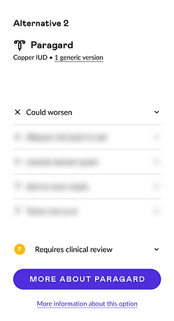
Recommendation table
The Recommendation Table is a vital component of the report, enabling users to discover the most suitable birth control option. Here's a breakdown of its key elements:
-
Symptoms: Users' reported symptoms, with their prioritized "dealbreaker" symptom, are displayed on the left side to guide recommendations.
-
Birth Control Method Cards: Each method is presented as a card on the right, beginning with the "top recommendation", framed in purple and providing important information to help users make a decision, ensuring that they have the final say.
-
"Order Prescription" CTA: Located at the bottom of each card, this button allows users to proceed to order their selected prescription from their preferred pharmacy.
-


Explanation of symptoms
To allow users to further understand their symptoms and conditions, we’ve added a symptoms section below the recommendation table. Here they’ll find each of the symptoms mentioned during the HA with a concise explanation of their possible causes, based on scientific literature. We also provide a “wellness score” based on the answers they provided during the HA, that reflects how said symptom is perceived to affect their day-to-day lives.
* Copy on the module was generated by ChatGPT to protect IP and may or may not be scientifically accurate.
Evolution of the product
This report went through multiple iterations over 3 years to provide the best experience for users and addressed their needs, which were communicated through user testing and interviews. At the same time, we had to make sure we were adhering to HIPAA regulations.


Creation of Tuune's Design Library
As we progressed through these iterations, we started to notice patterns and recurring elements in the design. This sparked the idea of adopt a modular design approach and, pausing the iterations for a bit, we started creating Figma components to reuse them throughout the report, based on existing Material UI components. This was the beginning of the Tuune Design Library.
Having a Design Library allowed us to have a consistent look and feel throughout the product and our designs, all while saving time and effort when it came to designing the rest of the product.

Working alongside Rosa has been an incredible experience. Her work ethic, dedication, creativity, attention to detail, and passion for improving user experiences have undeniably elevated our product.
“
Shardi Nahavandi
Tuune co-founder and CEO
Visit my other projects

SOCIOSMART
LOYALTY PROGRAM APP
Redesign and restructuring of their existing app and addition of new features to increase brand loyalty.

ROCKHER
E-COMMERCE
Translation of a catalogue mail order business model into an e-commerce, and doing it in the smoothest way possible for their existing users.

COCOROSE LONDON
RESPONSIVE WEBSITE
Redesign of their responsive website to make the online shopping experience seamless for their core audience.